
Have also spent time learning to use Dreamweaver to revamp my website. It is time consuming with not much to show for it yet. Have made a layout of my opening page but cannot decide whether to have a bold theme or a gentle one. My husband says to go bold. Will create a few and then decide.

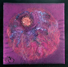
This is one idea.
Back to the tags - was having a problem machining a piece of gold leather then realised I hadn't put the embroidery foot on - feel such an idiot sometimes. It's an age thing!!!!


2 comments:
Good going on the web page front - maybe something which isn't too loud and lets your work jump out rather than the logo ;)) Have a look at colour recommendations for exhibition walls... I know that a sage green is a good colour to hand things on, and black is quite effective as everything jumps off it. Some colours are known to knock the stuffing out of art work but I guess it depends on what colours are in the pieces. there's a nice little site to try out some colour combinations at http://www.colourlovers.com/
Hi Shirley
I tend to go for a minimilist look , I get very confused when I go onto a web site with a lot on the home page and sometimes I can't even find out how to enter the site, but maybe that's an age thing too!
Thanks for your comments on my post, I think you're right.
Post a Comment